The main window
When DataStar opens, you land on the main window. This is a tour of the regions that make it up.
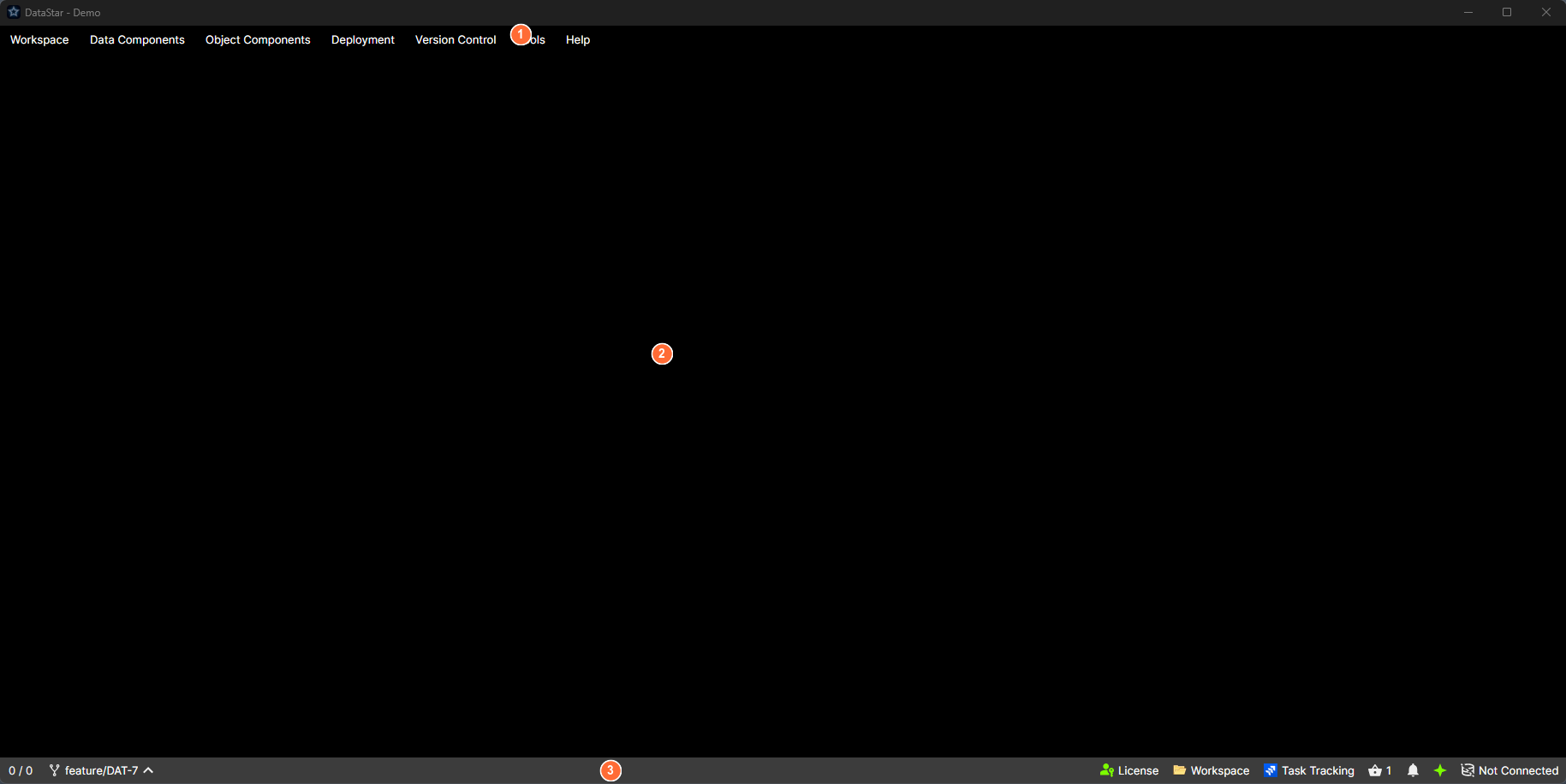
- Menu bar: top-level menus for the workspace, components, deployments, version control, tools, and help.
- Main area: a tab strip holding every open view, plus a notifications panel that slides in from the right.
- Status bar: indicators for selection count, version control, licence, workspace, task tracking, basket, notifications, MCP, and database.
Layout
Three horizontal bands, top to bottom:
| Band | Contents |
|---|---|
| Menu bar | Top-level menus for the workspace, components, deployments, version control, tools, and help. Full list: menu reference. |
| Main area | A tab strip (centre) and, on the right, a notifications panel that slides in when you toggle it. |
| Status bar | Indicators for selection count, version control, licence, workspace, task tracking, basket, notifications, MCP, and database. See the status bar. |
Navigation is entirely tab-driven. There is no left-hand sidebar. Each DataStar window is scoped to a single workspace, and the tab strip holds the views and editors you've opened inside it (component editors, template editors, version-control views, SQL editors, the basket, logs, and so on). To work in a second workspace at the same time, launch another DataStar instance.
Menu bar
The menu bar is the primary way to open things. The top-level menus are:
- Workspace: open or switch workspaces, edit settings, browse templates, open the basket, manage connections.
- Data Components and Object Components: one item per component category defined by your templates. Only shown if the workspace has components of that kind.
- Deployment: create, import, or open deployments; run the Release Workflow; browse packages and history.
- Version Control: items appropriate to the workspace's VCS (Git or TFS).
- Tools: clear the schema cache, open application logs, edit user preferences.
- Help: documentation, licence, about.
Every item across every menu is listed in the menu reference.
Tab strip
Every open view is a tab. Tabs can be reordered by dragging. Tab headers can show several markers:
- A title and an icon.
- A DRAFT badge when the view shows draft content.
- An alert marker (
!) when the view has something the user should look at. - A pencil icon when the view has unsaved changes.
Tab context menu
Right-click any tab for these actions:
- Close
- Close All
- Close All But This
- Close Unchanged
- Close All to the Left / Close All to the Right
- Sort Tabs A → Z / Sort Tabs Z → A
For the list of tab kinds you'll encounter, see tabs overview.
Notifications panel
A panel that slides in from the right. You open it from the Notifications button in the status bar. Each notification has an icon, title, message, timestamp, and a dismiss button. The panel header has Dismiss all and a pin toggle so the panel stays open while you work.
When the panel is closed, new notifications appear as a count badge on the status-bar button.
What to learn next
- Tabs overview: detail on every tab kind.
- The status bar: every indicator explained.
- Menu reference: exhaustive list of menu items.
- Keyboard shortcuts: every shortcut, grouped by scope.
- The component grid: the tab you'll spend most time on.